Tangible Interaction with Music (2003)
Miguel Bruns
2003
Supervisory Team
David Keyson
Amina Ait El Houssi
Jouke Verlinden
Smart Surroundings
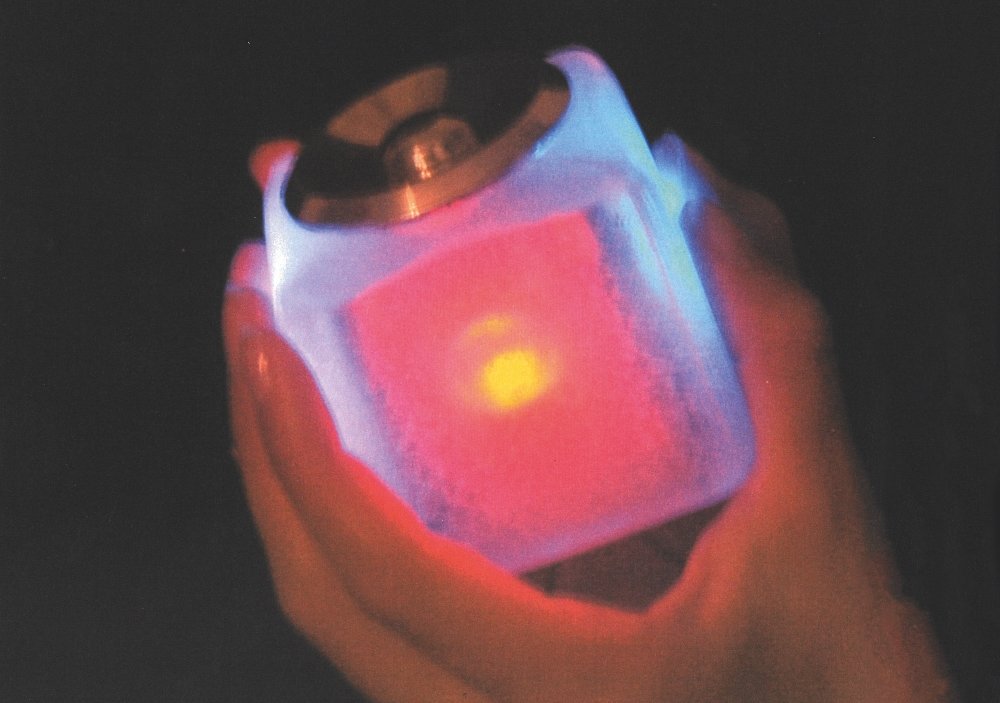
Playing music on a computer lacked the tangible interaction of handling CDs or LPs, but burning music on a CD took away some of the advantages of the digital format. Miguel Bruns’s MusicCube combined the best of both worlds.
Users could create their own playlists and assign them a colour. Four coloured sidelights on the cube indicated the various playlists, that were selected by placing the desired colour upwards. You could adjust the volume and navigate songs with a rotary dial on the top. Its multi-modal feedback options included a female voice reflecting back your choices: “volume now at maximum level”.
Presaging the iPod’s shake to shuffle function, users could shake the cube to activate it, as well as to shuffle songs. Putting the cube upside down would switch it off. Test users enjoyed handling the cube, and a YouTube video got 24,000 hits in a month – large numbers for those days.
Watch the interview:
(English subtitles available)
About the design process:

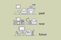
The project was a critique on how we interact with digital information (i.e. through a screen), and was inspired by Philips Design’s vision of the future in which “the house of the future will look more like the house of the past than the house of today”.
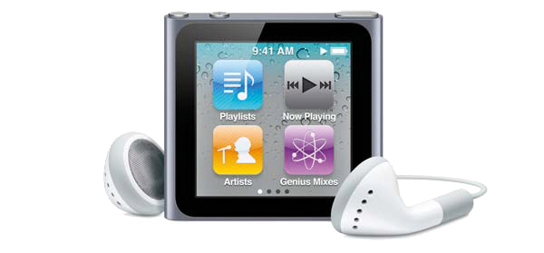
The rise of the MP3 format meant you could keep thousands of music tracks on your PC. The first portable players offered Walkman-like freedom, and the iconic iPod soon followed.

