Colour
People are at the heart of TU Delft. Everything we do begins and ends with the people involved. Openness and diversity are important principles in this regard. This is why we use a diverse colour palette with enough warm colours to match the flame.
See below for general online use and print colours. Click here to see the colours available in Typo.
Primary colours
Cyan is the primary colour and is always used in your communication. In addition, the secondary colour palette can be used as a supplement.
|
Cyan For print: CMYK (100%, 0%, 0%, 0%) Online: RGB (0, 166, 214) #00A6D6 |
White For print: CMYK (0%, 0%, 0%, 0%) Online: RGB (255, 255, 255) #FFFFFF |
Black For print: CMYK (0%, 0%, 0%, 100%) Online: RGB (0, 0, 0) #000000 |
Secondary colours
The secondary colours are modern, fresh and powerful, matching or contrasting with cyan. The colours may be used freely and cannot be claimed.
|
Dark Blue For print: CMYK (100%, 80%, 8%, 70%) Online: RGB (12, 35, 64) #0C2340 |
Turquoise For print: CMYK (72%, 0%, 24%, 0%) Online: RGB (0, 184, 200) #00B8C8 |
Royal Blue For print: CMYK (98%, 40%, 0%, 0%) Online: RGB (0, 118, 194) #0076C2 |
|
Light Purple For print: CMYK (65%, 100%, 0%, 12%) Online: RGB (111, 29, 119) #6F1D77 |
Pink For print: CMYK (0%, 70%, 0%, 0%) Online: RGB (239, 96, 163) #EF60A3 |
Burgundy For print: CMYK (5%, 100%, 48%, 30%) Online: RGB (165, 0, 52) #A50034 |
|
Red For print: CMYK (0%, 85%, 75%, 0%) Online: RGB (224, 60, 49) #E03C31 |
Orange For print: CMYK (0%, 70%, 75%, 0%) Online: RGB (237, 104, 66) #EC6842 |
Yellow For print: CMYK (0%, 31%, 98%, 0%) Online: RGB (255, 184, 28) #FFB81C |
|
Green For print: CMYK (63%, 0%, 84%, 0%) Online: RGB (108, 194, 74) #6CC24A |
Forrest Green For print: CMYK (100%, 0%, 68%, 4%) Online: RGB (0, 155, 119) #009B77 |
Dark Grey Drukwerk: CMYK (0%, 0%, 0%, 80%) Online: RGB (92, 92, 92) #5C5C5C |
Transparency
Sometimes it may be desirable to apply transparency within a color. When using transparency, there are some important guidelines to adhere to.
- Transparency may be applied to secondary design elements such as backgrounds and graphic accents and images.
- Transparency may be used behind a text as a background. Provide sufficient contrast to ensure readability.
- No transparency on primary color areas: Transparency should not be used on color areas that contain important information or key messages. These color areas should be bright and full of presence to properly fulfill their informational function.
- Important: The TU Delft logo should never be made transparent. The logo should always be used in its original form and color. This ensures that the logo remains recognizable and the identity of TU Delft remains strong.
Color coverage
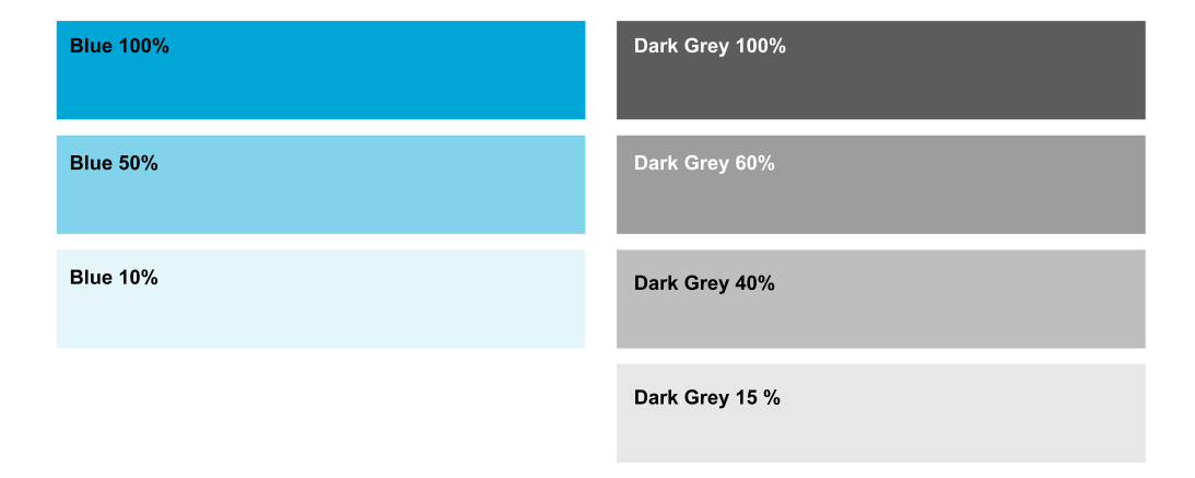
We use our colors at full 100% coverage. However, sometimes it is desirable to apply transparency or adjust different degrees of coverage of certain shades. This should only be applied to surfaces and not to text or logos. When using transparency, it is important to always check the contrast values carefully to ensure readability and visual impact. We apply variable coverage only to Blue and Dark Grey in the following percentages:

