The open payment border concept
The open payment border
Goal
To make checking in and out a more fluent experience in all three travel domains (train, tram/bus, metro). This lowers the cognitive load that checking in and out takes, and should thus reduce the number of missed check-ins and outs.
Field study: analysis of use
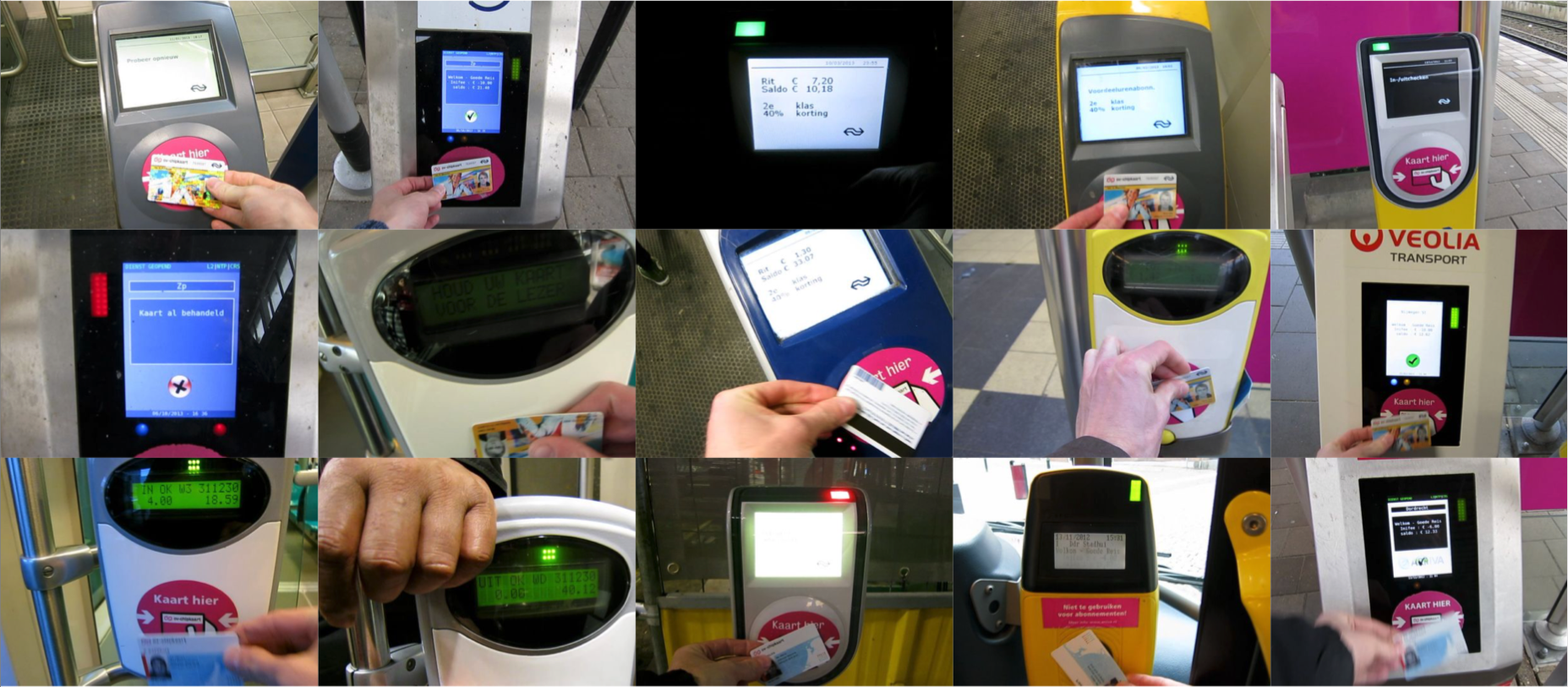
An analysis was made across all physical OV-chipkaart touch points of their functions, user interfaces, and interactions. An inventory was made of the primary usability issues per touch point. In addition, during observation studies in the three travel domains the build-up of the check in/out zone was analysed, as well as the behaviour of travelers within this zone. Finally the researcher filmed and analysed his personal interactions with poles and gates for six months.
Based on these studies, an overview was created of the phases and actions (on a micro-level) that take place during checking in- and out: the check-in and check-out flow’. The character of the interactions with poles and gates was captured in this video (in Dutch, English subtitles). What would a human being be like if he or she would exhibit the same behaviour as the OV-chipkaart pole? Also a video of a friendlier version was made, which serves as a metaphor for the desired future behaviour of poles and gates.
Conceiving the payment border concept
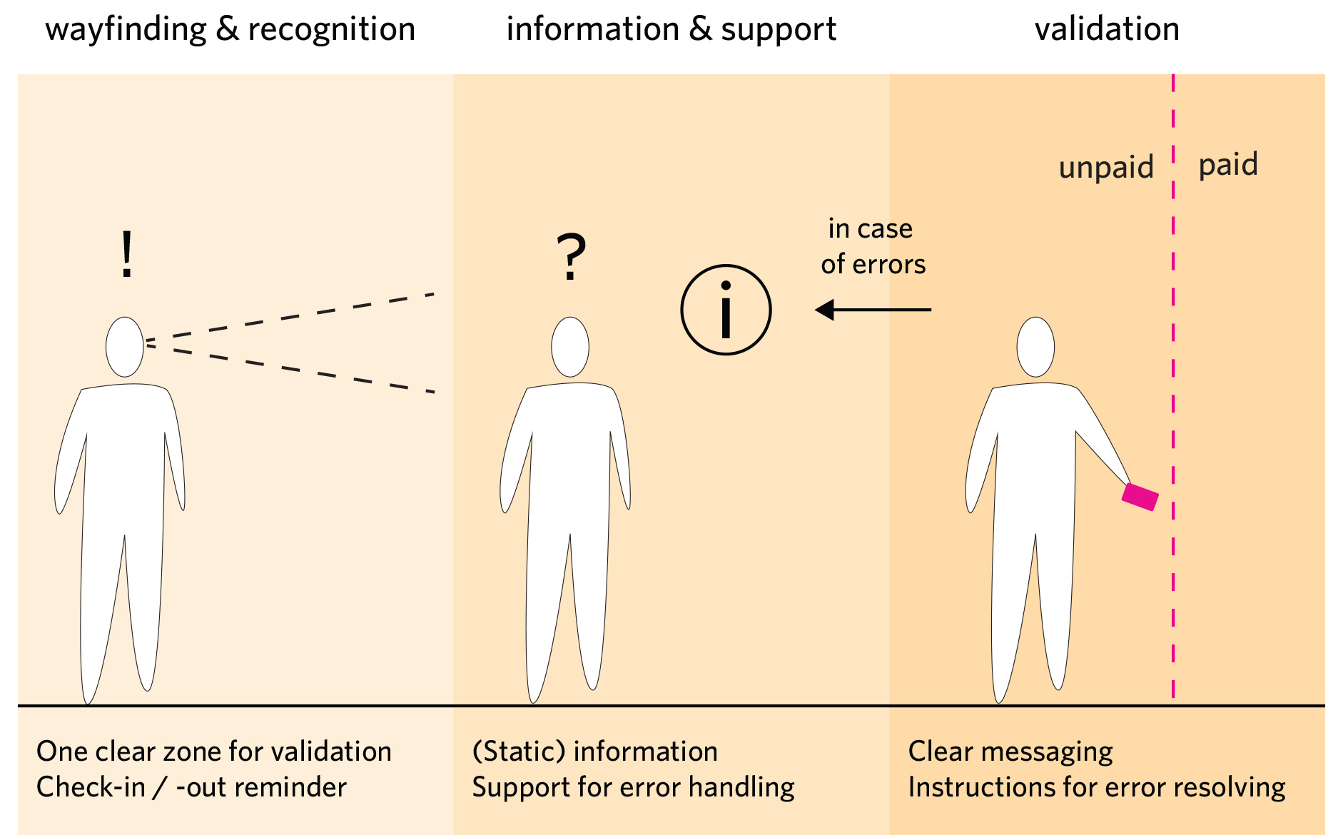
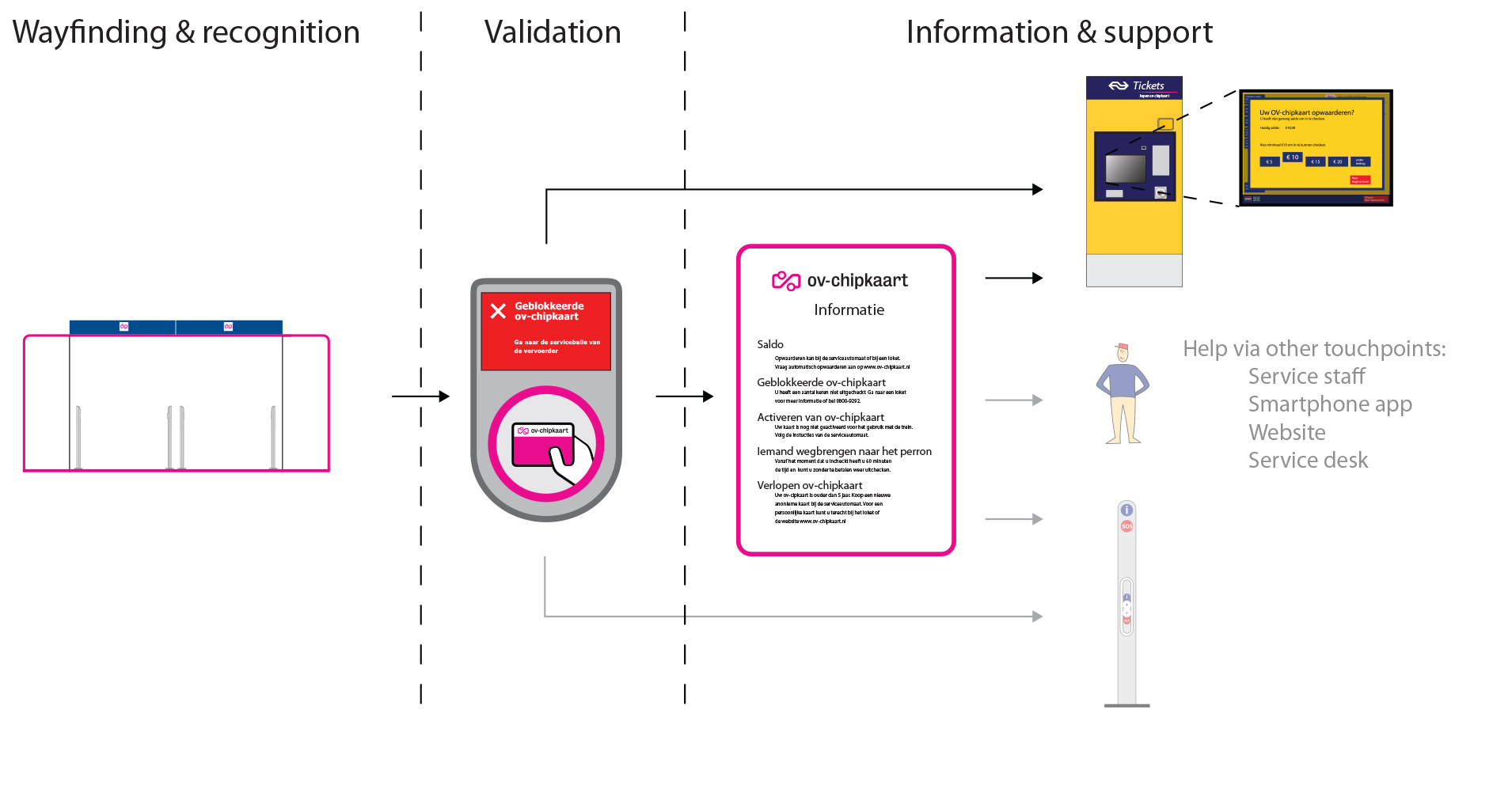
Based on the preceding findings, the basic interaction concept was developed for 'the payment border': the transition zone in which travellers cross the boundary from public area to the (paid) travel area and thus must identify themselves and pay (checking in or out). The transition consists of three phases (see image in the sideline):
- Wayfinding and recognition;
- Information and support;
- Validation.
The design process
The principles of the payment border concept can be applied in open payment borders (poles), closed payment borders (gates) and in vehicles. Because the design challenge was the greatest for the open payment border it was decided to come up with a detailed design for this situation. This design was evaluated with participants using a mock-up, physical interactive prototype and screen shots, based on which the design was further optimised.
The design
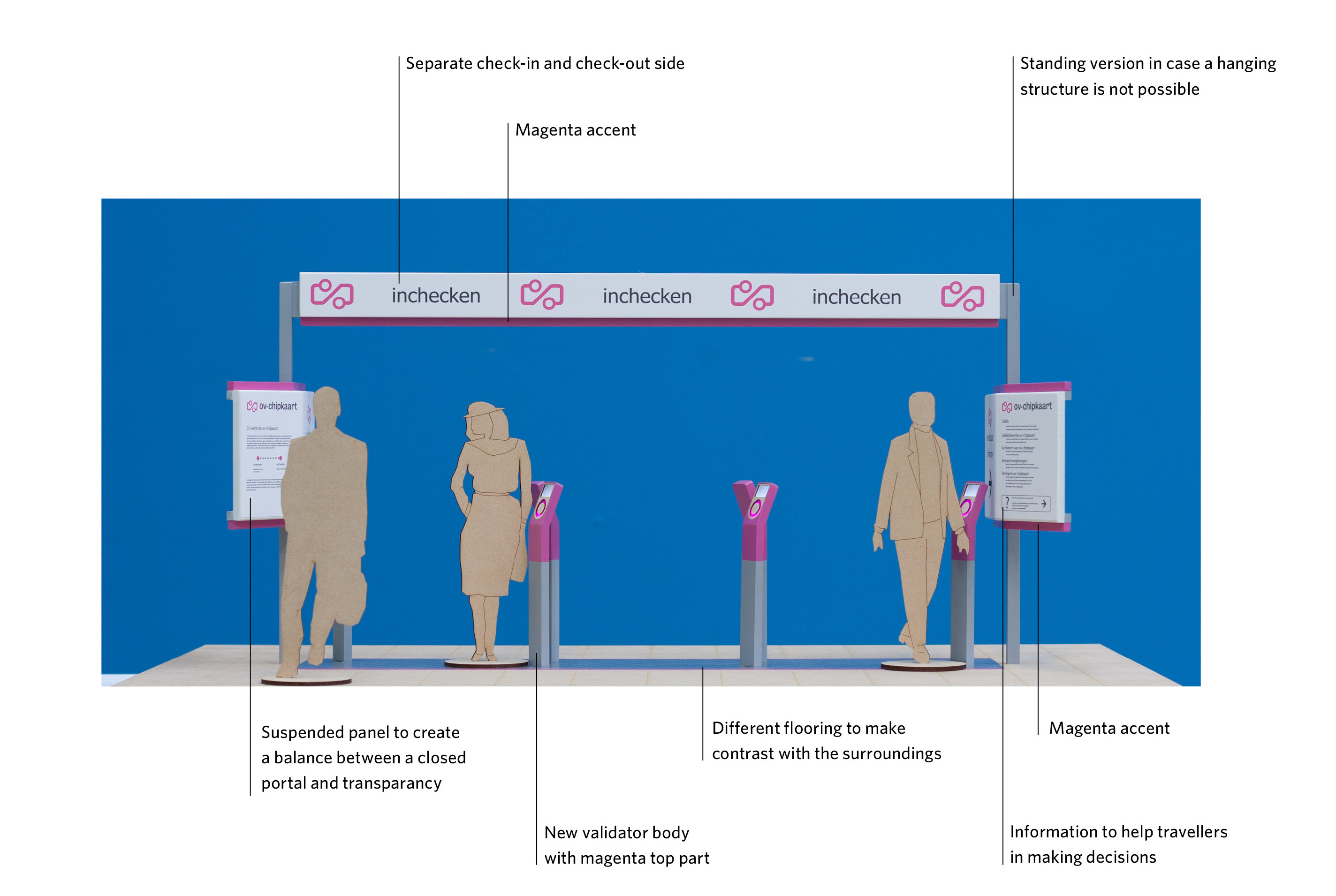
The result is an open payment border (see image below) that:
- Is easily recognised from a distance because of the overhead portal, the consistent location within stations and the OV-chipkaart branding;
- Makes the validation step easier because of adjustments to the dimensions and appearance of poles and gates;
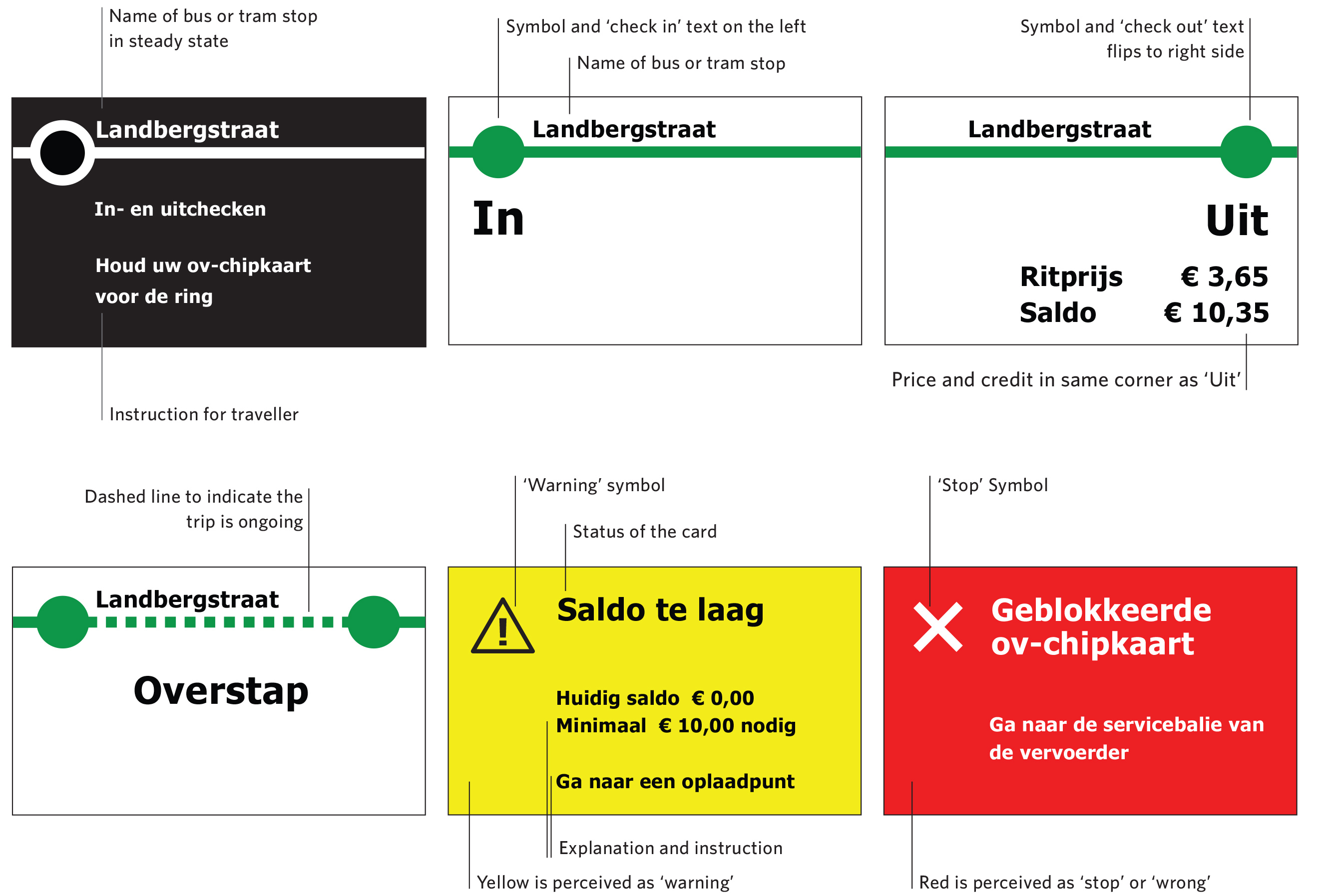
- Provides clear feedback by adjustments in the on-screen layout and messaging on poles and gates;
- Clearly communicates the rules of the OV-chipkaart system through the signs (posters) at the sides of the portal;
- In case of a problem provides users with a clear description of the issue and helps them to find a solution.

