Mobile ticketing for public transport
Mobile ticketing for public transport
Problem statement
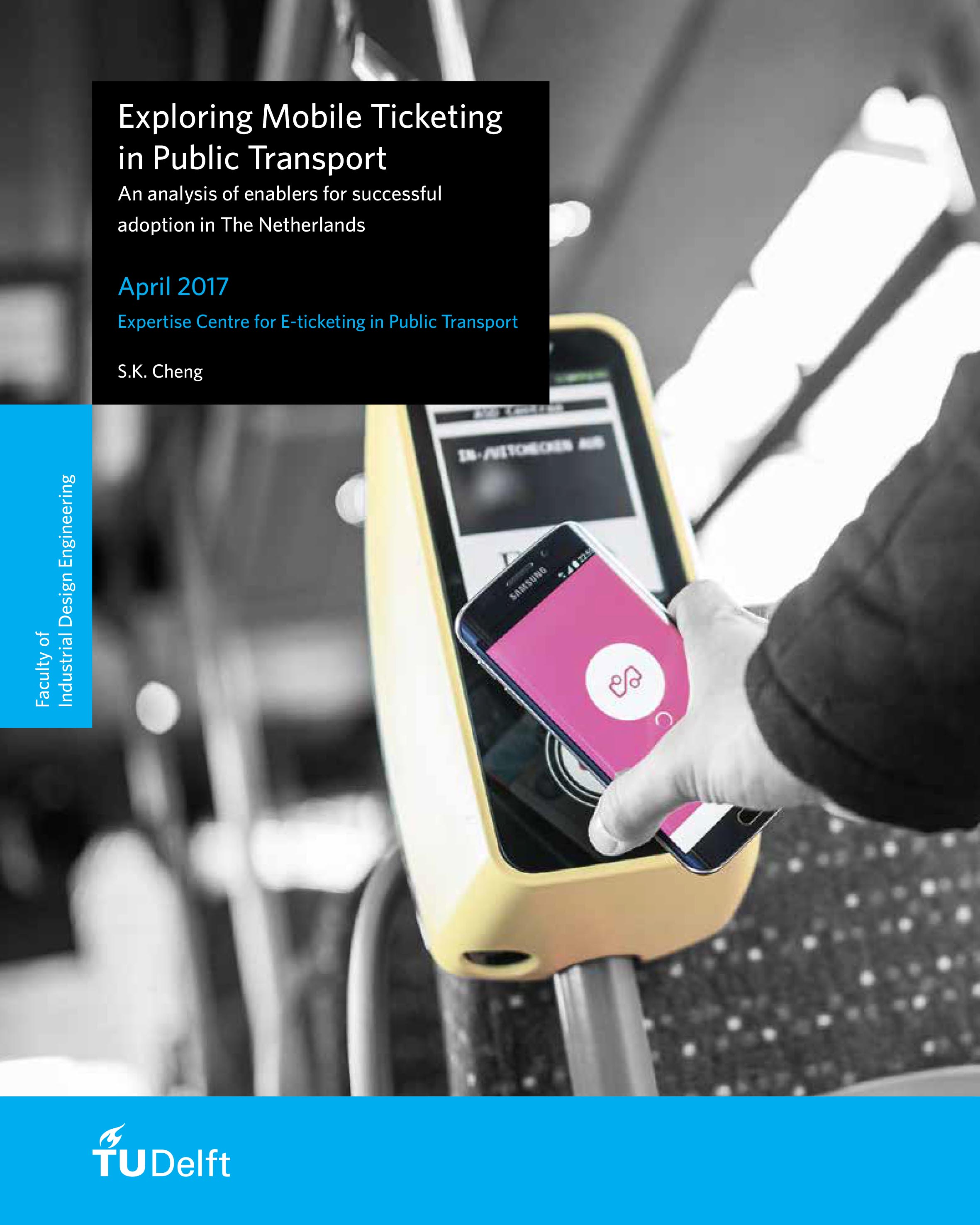
A good implementation of a user-centred mobile ticketing solution could increase the usability of and satisfaction with the Dutch public transportation system. However, the stakeholders involved in the public transportation sector often have opposing requirements and ideas, making alignment complex. However, a mobile ticketing solution that does not meet user needs would add even more confusion to the already complex public transportation system in the Netherlands.
Goal
To create a mobile ticketing solution which draws people out of their cars and into public transport.
Approach
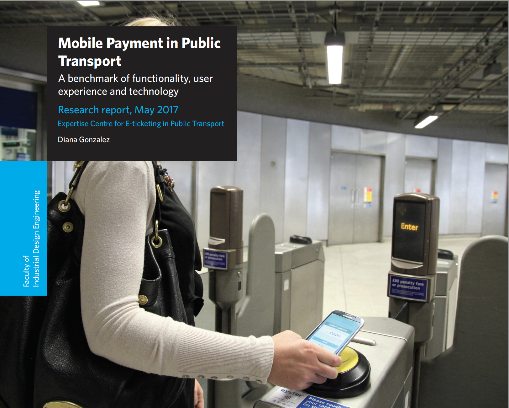
First an online survey was conducted to create an overview of mobile public transport ticketing systems worldwide. Of four of these systems the technological platform, functionality and user experience were analysed in more detail through desk research.
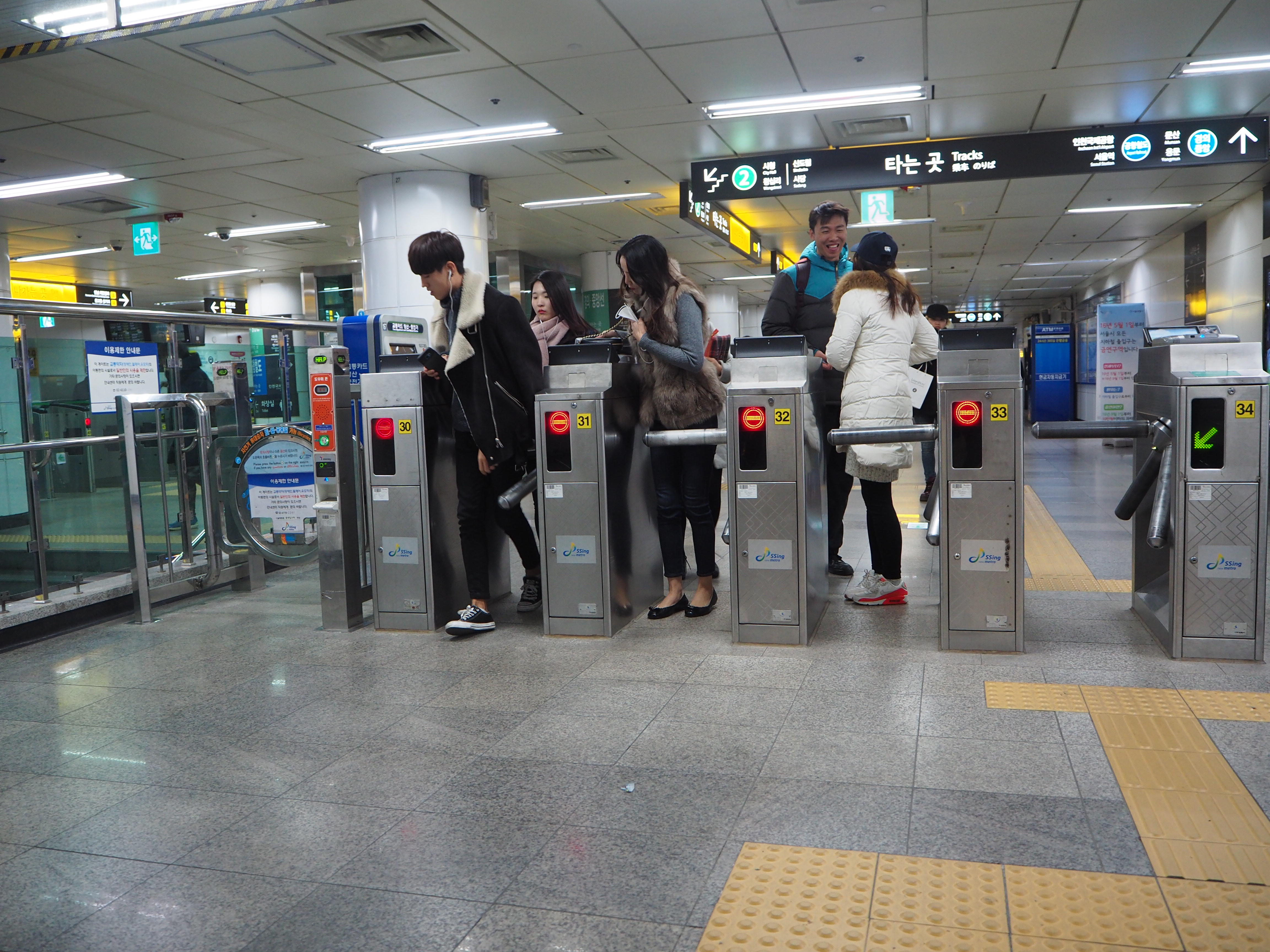
Next, an in-depth field study was conducted of the solutions available in Oslo (Ruter), London (Oyster) and Seoul (Mobile T-money), focussing on the factors influencing adoption rate and traveller experience. Based on this guidelines were proposed for a successful implementation of mobile ticketing solutions in the Netherlands. By conducting user and stakeholder interviews and by evaluating ideas and concepts with participants, the basic working principles of the new service could be identified.
Based on these design principles, a customer journey and user interface design were created. A first, interactive prototype of the OV-betalen app was created and evaluated with users. Based on their input the service design and user interface were further refined.
Insights from the online benchmark and field study
- Make sure the onboarding process is efficient by providing a set-up process that travellers are able to conduct on the go.
- Allow for immediate travel through a virtual mobile OV-chipkaart without high financial barriers.
- Create a dynamic interface and adapt to the traveller’s journey by providing context dependent information, such as arrival times.
- Provide the right information at the right time. Unburden travellers from uncertainty by pro-actively providing them with important contextual information.
- Mix Matters and provide clear distinguishable alternatives as travellers can have different preferences for fare media.
- Make sure that a mobile ticketing solution can operate independently from location-bound machines. (e.g. mobile top up)
Design
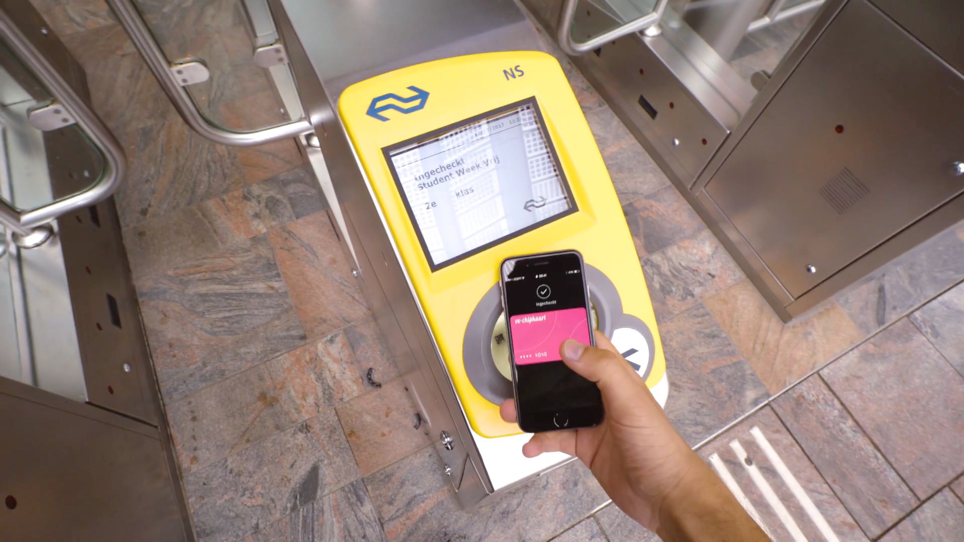
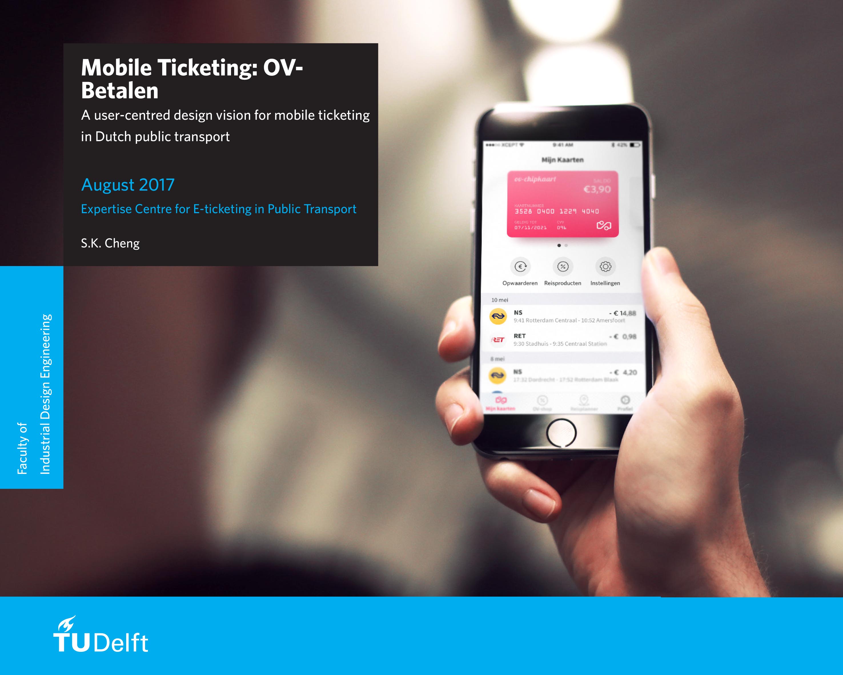
A mobile ticketing solution called the OV-betalen app which makes it possible to connect both OV-chipcards as well as bank cards.
Key aspects of the design:
- Services and information of all transport operators in one app: checking travel times, comparing and acuiring season tickets, fixing missed check-outs is all available;
- Both manual as well as auto-reload top up to give users both control and convenience;
- Online validators & back end fare calculation with EMV;
- Travellers receive a letter with information and a new generation OV-chipcard;
- Checking in and out by holding phone against validator without having to open a specific section in the OV-betalen app;
- Advice based on travel behaviour to help users get the right travel product for them;
- Alert notifications for amongst other things to give check-in and check-out feedback.

