Improving public transport ticketing for international air travellers
Problem statement
International travellers, who are quite frequently first time users of the system, do not know how to acquire an OV-chipkaart and which travel products to select, and have no established routines with regard to using the card while travelling (as opposed to domestic travellers). Therefore, in general international travellers make more mistakes throughout their journey.
Goal
To develop a future vision and service design that improves the user experience of OV-betalen (public transport ticketing) for international travellers arriving at a Dutch airport.
Approach
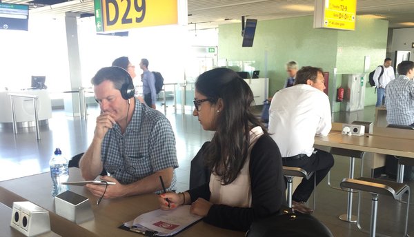
A qualitative field study was carried out in the Dutch OV-chipkaart system together with a benchmark research in comparable electronic payment systems in London (Oyster), Hong Kong (Octopus) and Denmark (DOT). The research yielded four improvement areas which could be used as input for the design phase. The design phase consisted of an iterative process of ideation and evaluation by users and project partners. The evaluation results were taken into account to develop a future vision and service proposition. Finally, the future vision and service proposition were iterated based on the arguments provided by users and project partners to make the Dutch public transportation system more desirable, as well as feasible and viable.
Insights from the field study and international benchmark
- Travellers often have the perception that using an electronic payment card is only relevant as a local but not as a tourist;
- Many travellers prefer to talk to service personnel rather than looking for information themselves;
- The usage of smartphones, especially Google (Maps) is widespread and perceived as very useful;
- International travellers have trouble not forgetting to check in and out at open payment borders (with poles instead of gates);
- International travellers often do not understand or misunderstand the terminology of ticket names and travel products;
- Many problems related to payment (e.g. cash, debit card, credit card) at ticket vending machines were encountered that made the start of their public transport experience of travellers negative;
- Travellers often do not know what to do next and what is expected of them to continue their journey.
Design
Future vision
Dutch public transportation is one system, ran by multiple operators, that cooperate in the back end to provide transparent and unified information to facilitate the usage of the system to its customers in the front end, in areas, where they do not compete.
Service proposition
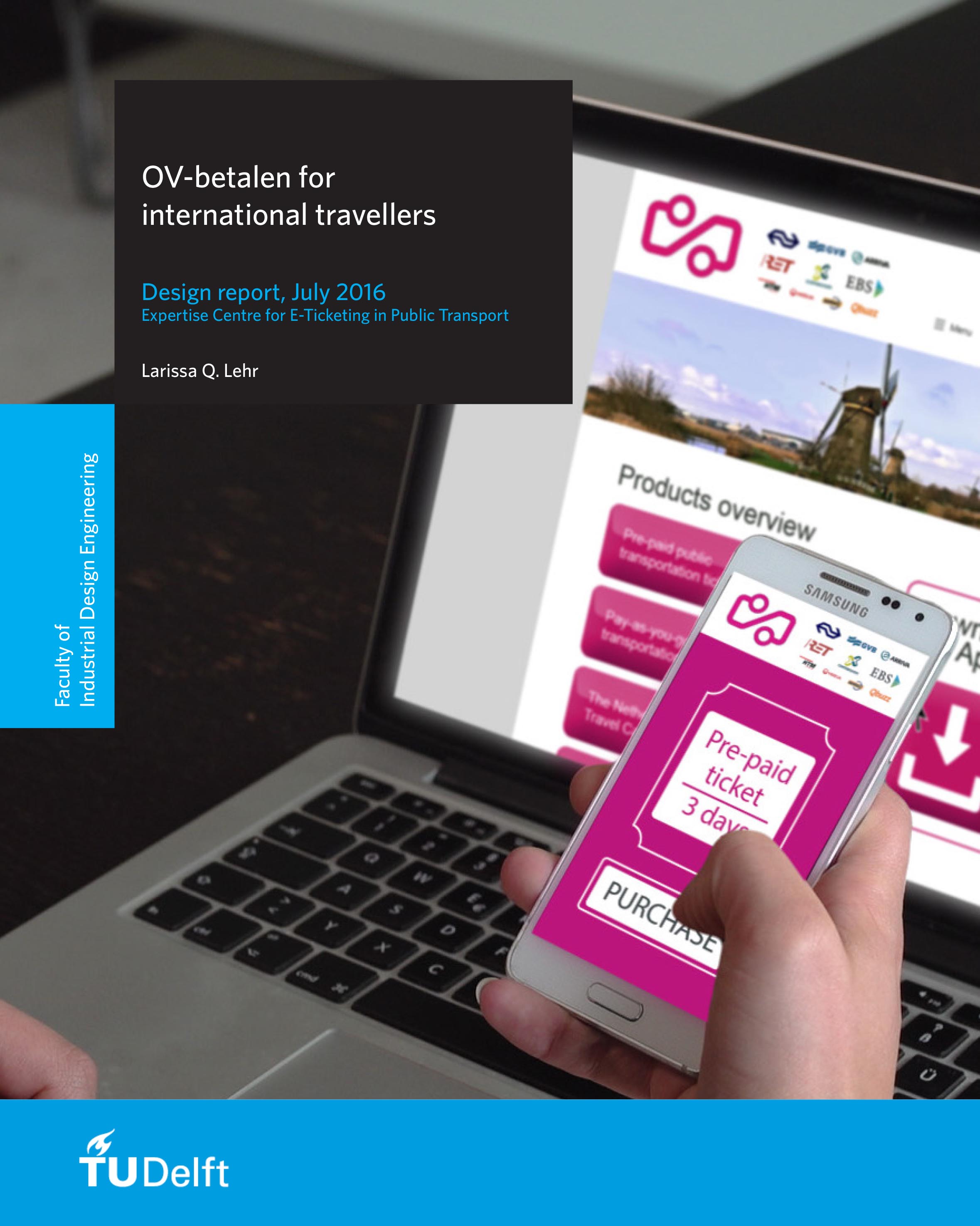
The service focuses on improving information provision by enhancing its accessibility, transparency and clarity. It is a digitized system in which travelers purchase and pay tickets via the smartphone, given that there is WiFi network throughout use contexts and travel phases. Alternatives and back-up options to the digital services are always available as well as a balance between self-service and service personnel.
Design aspects
- One official app to provide all information regarding the public transportation system in the Netherlands;
- A more user-friendly ticket vending machines that is jointly developed by the operator which provides the travellers with all possible transportation tickets;
- Service personnel of all operators have the role of host to the Netherlands and are also knowledgeable about the entire Dutch public transportation system;
- Gates at stations that are equipped with beacon technology and that work the same throughout the Dutch public transportation system regardless of the operators.


