Gate flow and user experience of public transport gates
Gate flow and experience
Problem statement
E-ticketing gates for public transportation with suboptimal interaction can cause congestions, as well as stress and discomfort for users. This can in turn lead to discouragement of public transport usage.
Goal
To design a user-centered closed payment border for public transport.
Approach
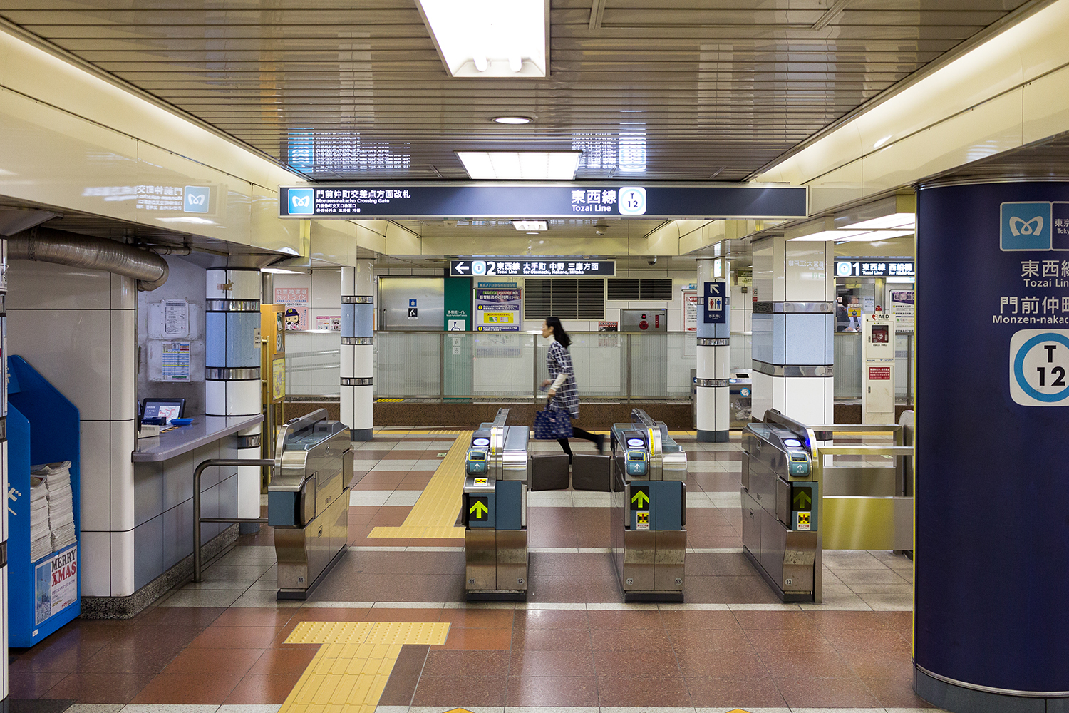
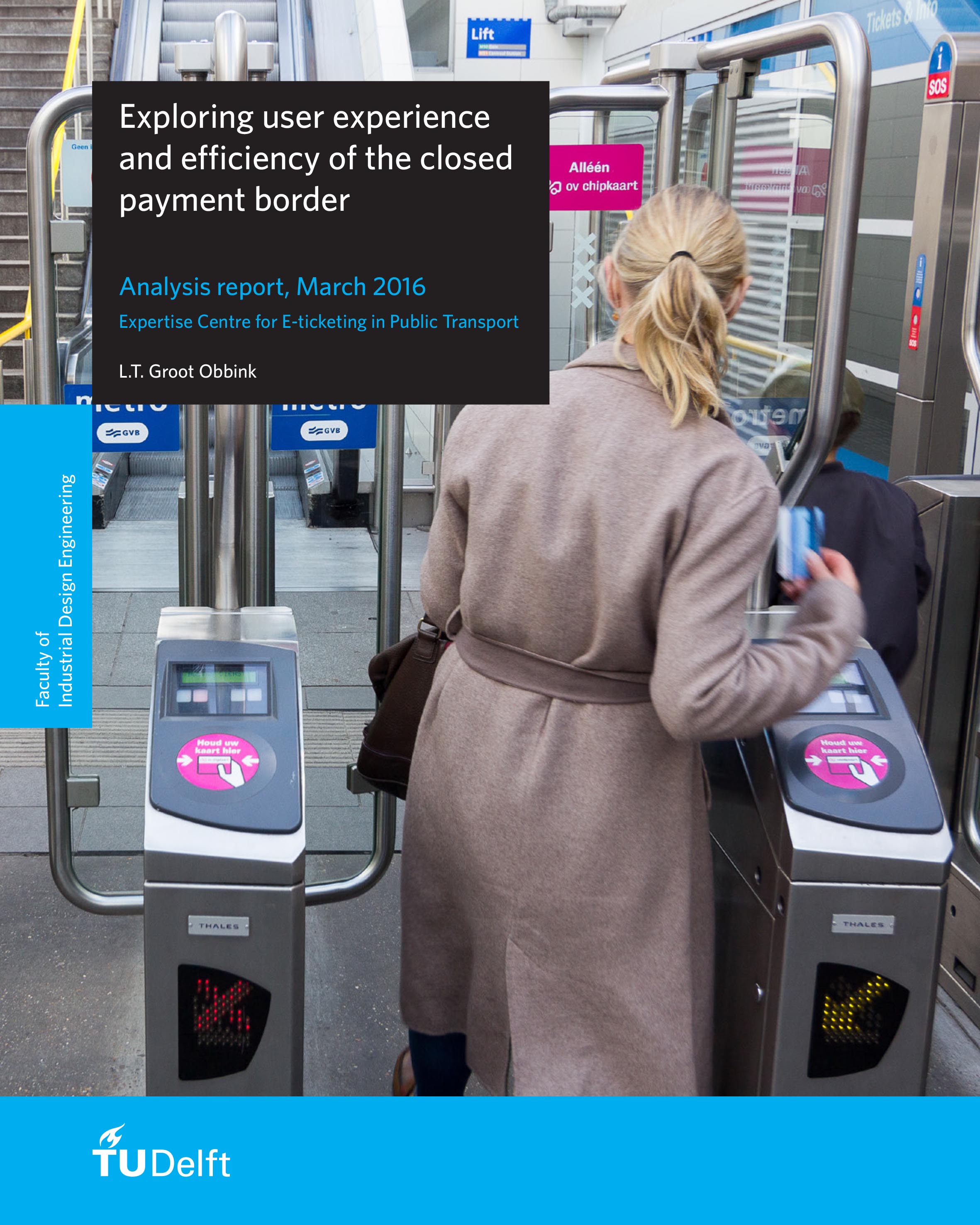
Field research was performed within the public transport system of the Netherlands to determine the context, usage patterns and user experience issues of the closed payment border. By also conducting field studies the usage of payment borders of London, Hong Kong and Tokyo, opportunities were identified to enhance the Dutch payment border.
The findings from the field research made it possible to create several partial design solutions which were then clustered into four different concepts. These concepts were evaluated with stakeholders, using 3D-printed scale models and digital renderings of the concepts, and subsequently one concept was selected. Several design aspects from other concepts were added to the chosen concept and the design was improved and detailed.
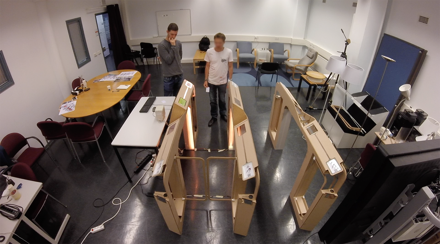
A new design for the Dutch closed payment border was proposed and evaluated with participants in a user test with the use of a live size fully interactive prototype of the gate design, as well as with the help of a virtual reality simulation of a gate line in context of use at a Dutch railway station. After the proposed design was evaluated in the user test, changes in the design were made and the final design was proposed.
Insights from the field study and international benchmark
- Adding space between the validator sensor and feedback display benefits the walk flow of travellers;
- The usage of colours on the gates provides travellers with more feed forward to indicate which transport operator they are checking in with;
- When it is insufficiently clear which validator sensor belongs to which gate door, travellers might validate on the wrong side of doors;
- Using a validator sensor with distinctive light and no distracting elements around it helps travellers find it easily;
- A screen swipe and validator light blink destincts the user’s check-in from the user before him.
Design
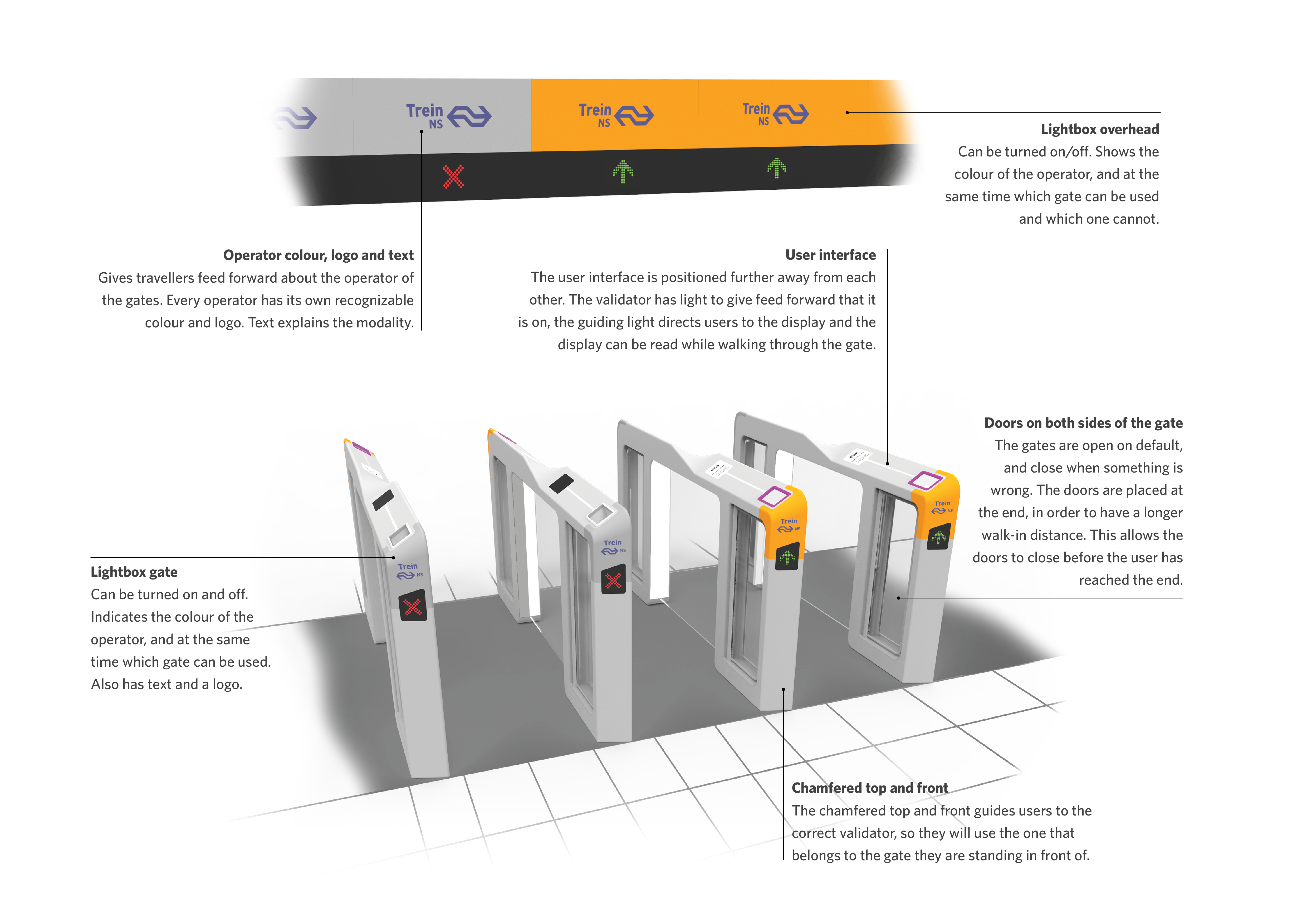
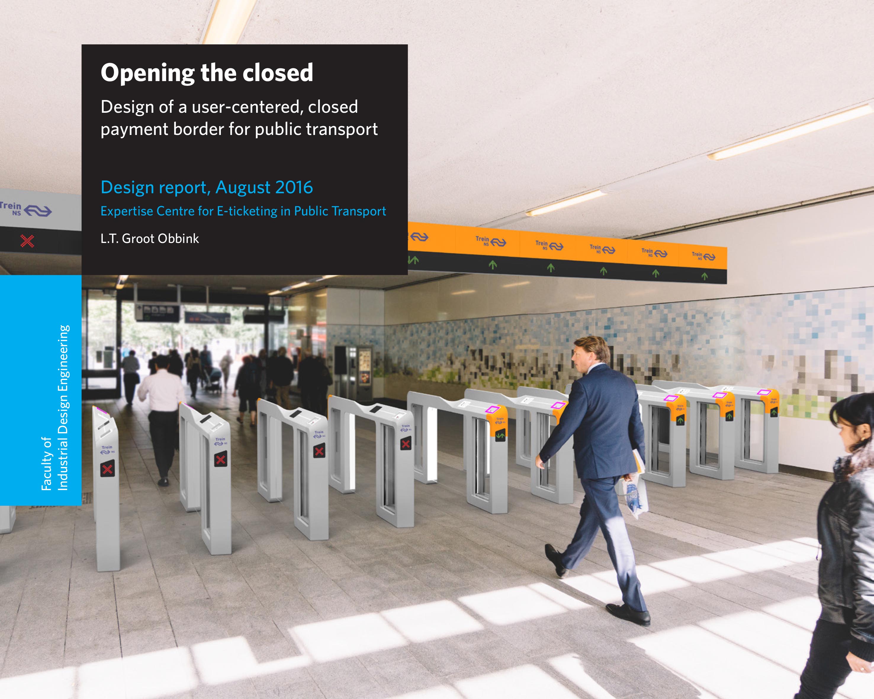
The proposed design for the closed payment border explores the advantages of having an open gateline, in combination with many new design elements with regard to the user interface, and the feedback and feed forward.
Design aspects:
- Colored lightbox at the front gives information about the operator and the status of the gate;
- Green and red arrows that show which gate can be used and which cannot;
- Overhead signage that gives the same feed forward as the lightbox and arrows when users approach the gateline;
- A user interface that is positioned further away and linked to a guiding light making it possible to be read while walking through the gate;
- A validator sensor with contrasting light to shows that it can be used and gives feedback through light and sound upon validation;
- Chamfered top and front that guides users to the correct validator.

