New Features
New Colours
New colours to as part of the updated colour palette
As part of TU Delft's updated colour palette, there have been a few changes to the available theme colours; while some colours have had minor updates in contrast and hue, a few more impactful changes have been made:
Three new colours have been added; royal blue, forest green and burgundy red.
The following colours have been corrected: yellow, orange, red, green, dark blue, purple and pink
Furthermore, teal has been replaced by turquoise and light purple has been removed from the palette.
Simulate time for accurate previews
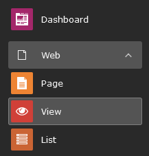
View your pages at any simulated time
So you've created a page with a publishing time or added timed elements and want to preview your result?
This used to be near impossible to properly preview the page. But no longer! With this new addition, you can enter the View module and after entering the date & time, a preview will be generated based on how the page will look on this exact moment. A very helpful tool when scheduling your content!


Dynamic Header slider
More creative freedom with your headers
We all know our current header slider element for creating standard headers on the pages. And in most cases, this will do just fine.
But... what if you want to create something more ... creative, appealing and/or fun? Play around with bigger images or additional call-to-actions or propositions on your slide, while still working within the styleguide framework? That is why we've added a new, more flexible, header element: our dynamic header.
With this element, you can add (ofcourse) individual slides, set the element height (based on screenheight percentage), set the gradient overlay (%), a slide theme colour, add additional text elements and set their position on the slide and a few extra toggles/switches and features too much to just generally list here. So, feel free to fiddle about, experiment with one or more slides and see what it can do for your website.
Please do keep in mind, that the element works best when using professional photos, so please refrain from using images consisting of logos or specific details all around the image and whatnot.
Concept for digital magazines
Browsing through a collection of pages, chapters and articles.
Something a bit more experimental and to be further developed as time goes by, but we made a start with creating a feature leaning towards digital magazines. In this release we focussed mainly on the creation of the backend features, making sure the framework itself works. In future releases we can focus more on creating the proper designed frontend, but to show an example: These release notes are also set-up as a 'magazine' (thus the blue horizontal navigation)
So what does this offer us right now? To start with, three new pagetypes: Magazine index, Magazine chapters and Magazine articles. These three records combined set the stage for our magazine. The index page defines how the magazine is structured, how the menu is set up and enables the horizontal navigation bar. The chapter and article pages set up the way you wish to structure or categorize your magazine.
Each chapter or article can be designed just like any other page; the same layouts are available as for regular pages.
Want to add an existing page to your magazine without copying all the content? TYPO3 has a trick for this as well: the [Display content from] feature. Just create a new article (or chapter) page and select the page you wish to display. All content from the original page will now be shown as part of your magazine.
Note: keep in mind that articles and chapters need an index to work.So when building, work top-down. Create an index record first, then a chapter, then an article.

